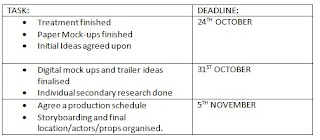
This is our schedule that the group created. This will enable us to keep to a plan of action, therefore preventing us from missing deadlines or falling behind with our progress. Having a group schedule as well as individual timetables, means that the group can work together more efficiently because we have agreed on group deadlines.
Wednesday, 20 October 2010
Tuesday, 19 October 2010
Treatment
Monday, 11 October 2010
Personal Timetable of Action Plan
Friday, 8 October 2010
Summary of Product & Audience Research
For my personal research I first analysed movies from a range of different genres such as; romcom, action and thriller. This giving a broader view on the way that film makers advertise their films. For instance, how colour can be adapted to a certain film, in 'Going the Distance' there were a lot of light colours and soft tones giving off an impression of light heartiness and romantic emotions. This I found being a complete contrast to how and what colours were used for the advertisement of 'Devil'. In this trailer and especially the poster, there were a lot of dark colours reflecting the sense of evil or death. I found in the poster, the whole image is black with a just a small portion of the poster, an elevator down button, being red. This symbolising danger or possibly the devil, with the button pointing toward hell? I also noticed with the poster how the unique selling points of a film are a huge focus on the poster, whether it be M. Night Shymalan in 'Devil', 'Resident Evil' in 3D or Drew Barrymore in 'Going the Distance'.
As our group ideas evolved I refined my research and analysis to the thriller genre as this is what we decided to make our film in. For analysis on cross media advertising, I looked at the film 'Buried' starring Ryan Reynolds, another unique selling point. Both the teaser and poster had very successful elements to sell the film and left me wandering what has happened, and has encouraged me to go and see the film. As well as my analysis, we as a group have set up a Yahoo! account and created a questionnaire about the film trailer, asking for the general public to watch it and then discuss what they thought and felt about how it worked etc. Although it can be assumed too general for audience research by having the questionnaire open for all, we did it purposely to see who actually did the questionnaire, this helping us determine a target audience. To coincide with this questionnaire, we created one on Facebook and sent the same questionnaire to selected 'friends' this making the research more refined. As these may not be as successful as we hope, we also constructed a Survey Monkey questionnaire which will give us added data. When collecting results we can then compare and contrast the three to understand who would be more approachable and successful to target in selling our film. We also conducted a more general questionnaire that we handed out to people, this was to useful for us to understand what parts of pyschographic and demographic factors to include in our final piece. To add more to this research we are setting up focus groups and we will record audience’s reactions to teaser trailers of the thriller genre.
To conclude my findings so far, I have understood that unique selling points are very successful; colours are very effective in symbolising elements of the film that you want to reveal. Also, music sound tracks are important and creative however simple they may be, they always add to the atmosphere.
Simplicity is something I have found to be very successful and is something my group and I are considering for our own, as we have learnt that this will be very valuable to the success of our trailer.
Thursday, 7 October 2010
Psychographic & Demographic
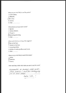
This chart below shows the results for question 2. This question being: What attracts you to go watch films? The results state that a massive 30% said the genre of the film, 27% being the stars of the film and only 18% being both the interesting advertising and famous directors.
Question 3's results show that a huge 38% say that
the star on the front of a magazine makes them want to buy it. Compared to a minor 9% saying it would be the interesting articles.
Questionnaire
This is an example of the questionnaire that we handed out to a group of people. Although some of the answers that we collected were not as helpful or useful as we had hoped, most of the replies we received gave us a lot of useful insight into what audiences want and expect from advertisements in the movie industry. This enables us to demonstrate these needs in our own project, making it all the more successful.
Technology Research
This is the software that we will be using to create our final product. iMovie is an advanced software product that will be the best to use in the creation of our teaser trailer. It provides us with a range of tools to input the immense detail that we need to edit and cut our trailer. Making it as professional as we can.
http://www.apple.com/ilife/imovie/
Final Cut
For the editing of our trailer we will most likely use Final Cut as it can provide us with reliable tools to make our trailer professional. It means we can easily and successfully edit our filming with ease. We can effortlessly transfer our recordings from our tape straight to Final Cut and then we can begin editing. The tools on Final Cut give us endless possibilities to customize our trailer, including transitions, sound effects and freedom to cut any parts we desire. During research of these products, I found out that Final Cut has been used by proffesionals to edit their work, such films include; Eat, Pray, Love and 500 Days of Summer.
http://www.apple.com/finalcutstudio/finalcutpro/
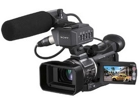
The Sony A1E Camera
http://www.sony.co.uk/biz/product/hdvcamcorders/hvr-a1e/overview
Wednesday, 6 October 2010
Analysis of Inception
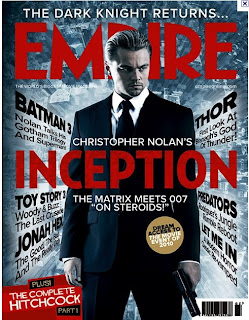
Inception Empire Cover
On this magazine cover of Empire, it is advertising the new Christopher Nolan film Inception. The main focus on the cover is Leonardo Dicaprio. He is one of the unique selling points of the movie that Empire can use to sell their magazine as well as advertise the film. Another would be mentioning the director. There are only three colours used throughout the page, red, black and grey/white. They have used red on the bold text to make it stand out against the softer tone background.The titles of the films are all in bold, to draw the eye and focus on the films. They have Dicaprio in the centre of the page, with the text framing him. This creates a symmetrical appearance to the page. The texts at the sides of the image are diagonal, but reaching into the page, this creating the sense of drama and uneasiness. Alongside this, the background image is of tall skyscraper buildings, which correspond with the alignment of the text, to create the illusion of falling. The image also conveys the possible location of the narrative, this appears to be a city, possibly New York.
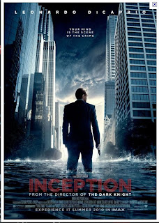
Inception movie poster
The poster for Inception has given a detailed presentation for expectations for the film. The main colours used in the poster are dark greys and black. There are very little bright colours, except for the text for the title which is red. This colour symbolises danger or something evil. The main image in the poster is of a city with skyscrapers, the centre of the poster is Leonardo DiCaprio standing with water up to his calves. This is not what we associate a city to look like, therefore the audience can automatically assume that the film contains some surreal content throughout the narrative. This image is represented both photographically and graphically, by the image of DiCaprio being photographed but the surroundings being graphically designed and enhanced. The messages in the poster are primarily visual so the audience can understand a lot from the image. The intended audience for the poster would be fans of Christopher Nolan and Leonardo DiCaprio, pre-determined audience, these are also unique selling points. To add, fans of action/thriller films that will be attracted by the images and the poster as a whole. The tagline reads ‘Your mind is the scene of the crime’, this could interpret that the film is a psychological thriller meaning it has added appeal. Overall the poster creates a positive representation of the film and sets up a good anticipation and excitement around the film.
Inception teaser trailer
Firstly the trailer lasts for approximately 1 minute 3 seconds, with 7 seconds being film production companies etc. The main background of the trailer is black, the first shot is of a spinning top. This implies to the audience that this object is very important to the narrative as it is the first image that we see. Christopher Nolan is used as a unique selling point as it also reminds the audience that he directed The Dark Knight. The text for this is continually in block capitals and always white, this portraying a sense of holiness or something magical. The text fades away and next there is a bird’s eye view of a busy city. There are skyscrapers and lots of traffic, this provides an assumption of the location of the film. The creators have also used Leonardo DiCaprio as a unique selling point in the trailer. They have used a close up of him to show that he’s starring in the movie, after this there is a line of text of his name.
Throughout the teaser they show clips of the movie, they have placed the tagline amongst these clips. The cuts get faster and the pace picks up displaying the action based parts of the film, these in turn creating expectations for the film. To end, there is a panoramic shot of the city again but as the shot rotates to face the audience the title INCEPTION is spelt out to end the trailer. Around the text there is maze which concludes that the film will include puzzles or people getting lost, both physically and mentally.
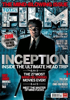
Inception Total Film Cover
This is the front cover of Total Film, another film magazine also promoting the film Inception. From looking at the magazine, I firstly noticed that they have used a similar colour scheme to Empire. I believe this could be relating to the genre of the film, which is thriller/action. The dark colours reflect a negative sense to the narrative, with the red contrasting to create a shock factor to the representation of the film. Another element to the layout which is similar is the use of buildings in the background image, conveying that this is the obvious location of the film. They also have placed Dicaprio in the centre of the cover both a medium shot.There is an in-direct mode of address used as Dicaprio is not looking directly at the audience.
Tuesday, 5 October 2010
Analysis of Enter The Void teaser
After the title has entered ‘ENTER’, there is an image of a young man laying it what appears to be a toilet cubicle. The audience can register that because of where he is, there is the possibility of drugs being involved, as he appears to have overdosed. The simplicity of the trailer maintains the anticipation of what the narrative is and keeps the audience asking questions on what has happened. After the camera has panned over the image of the young man, the remainder of the title appears saying: ‘THE VOID’.
Audience Research - Survey Monkey
Monday, 4 October 2010
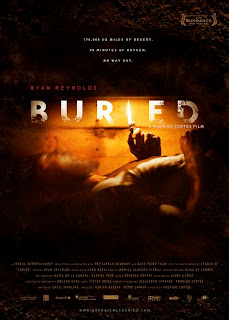
Buried Poster Analysis
This poster successfully demonstrates the potential storyline for the movie. Alongside the actual title of the movie, the audience can automatically associate the two together to gain a good expectation of the film. The main colours used in the poster are mainly dark this creating a sense of fear around the character. With the addition of the orangey tone light from the lighter there is a contrast of colours, this creating an uneasy feeling for the audience. The main figure/image in the poster is of the main character. We can see that he is trapped inside a wooden box, with only a lighter. His face appears distorted, giving the impression of movement. This gives life to the poster. The image is represented photographically with the addition of possible graphical editing to make the image more professional. Messages in the poster are both visual and verbal; the image is eye catching because of the panic that is brought to the image through the use of dark colours and the close-up image which highlights the claustrophobia feeling for the audience as well as the character. I think the intended audience for the poster would primarily be pre-determined audience for Ryan Reynolds and Rodrigo Cortes, but also fans of the thriller/horror genre. The use of the dark colours and the mise-en-scene elements of the poster put the film in the thriller genre, such conventions as; colours and scary images.
Analysis of 'Buried' teaser trailer
The teaser trailer for the film 'Buried' is very simplistic, however it creates an interesting and exciting buzz around the film's storyline.
Firstly, the trailer lasts approximately one minute and twelve seconds, this including opening credits of the production company at the beginning. Althought the teaser is reasonably short they succesfully advertise and sell the film within this short time.
What is most interesting about this film trailer is that majority of it is just in darkness, it is not untill the almost end of the trailer where a small amount of light is created from a lighter. This is the first glimse of any 'life' in the trailer that the audince sees. This use of limiting the mise-en-scene elements in the film, adds to the sense of mystery. The trailer has an overlay of the character speaking, through his tone of voice and the dialogue that he is saying, there is an eerie atmosphere created, this is greatly emphasised by the darkness. The audience can see that he is in some kind of wooden box 'buried' under, what appears to be, ground. From this image there is a great sense of claustrophobia, not only for the character but for the audience viewing the trailer.
Adding to all the hype from the effectiveness of the trailer content, there is also a pre-detrmined audience targeted as the well know actor Ryan Reynolds is starring in the main role. Having the trailer this simple leaves the audience with wonder as it makes the trailer more intriguing and creates an intense anticipation for the films release.