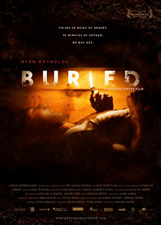
 This poster successfully demonstrates the potential storyline for the movie. Alongside the actual title of the movie, the audience can automatically associate the two together to gain a good expectation of the film. The main colours used in the poster are mainly dark this creating a sense of fear around the character. With the addition of the orangey tone light from the lighter there is a contrast of colours, this creating an uneasy feeling for the audience. The main figure/image in the poster is of the main character. We can see that he is trapped inside a wooden box, with only a lighter. His face appears distorted, giving the impression of movement. This gives life to the poster. The image is represented photographically with the addition of possible graphical editing to make the image more professional. Messages in the poster are both visual and verbal; the image is eye catching because of the panic that is brought to the image through the use of dark colours and the close-up image which highlights the claustrophobia feeling for the audience as well as the character. I think the intended audience for the poster would primarily be pre-determined audience for Ryan Reynolds and Rodrigo Cortes, but also fans of the thriller/horror genre. The use of the dark colours and the mise-en-scene elements of the poster put the film in the thriller genre, such conventions as; colours and scary images.
 Monday, 4 October 2010
Buried Poster Analysis
 This poster successfully demonstrates the potential storyline for the movie. Alongside the actual title of the movie, the audience can automatically associate the two together to gain a good expectation of the film. The main colours used in the poster are mainly dark this creating a sense of fear around the character. With the addition of the orangey tone light from the lighter there is a contrast of colours, this creating an uneasy feeling for the audience. The main figure/image in the poster is of the main character. We can see that he is trapped inside a wooden box, with only a lighter. His face appears distorted, giving the impression of movement. This gives life to the poster. The image is represented photographically with the addition of possible graphical editing to make the image more professional. Messages in the poster are both visual and verbal; the image is eye catching because of the panic that is brought to the image through the use of dark colours and the close-up image which highlights the claustrophobia feeling for the audience as well as the character. I think the intended audience for the poster would primarily be pre-determined audience for Ryan Reynolds and Rodrigo Cortes, but also fans of the thriller/horror genre. The use of the dark colours and the mise-en-scene elements of the poster put the film in the thriller genre, such conventions as; colours and scary images.
Subscribe to:
Post Comments (Atom)
No comments:
Post a Comment